5 Essential Features For A High-Converting Interior Design Website
Interior design is a sophisticated and high-end service that involves a lot of niche skills. It’s not just about selecting colors and decorating - interior designers bring much more to the table when it comes to making a living space functional by using their architectural sense, aesthetics, creativity, and logic. With that said, premium segment businesses like interior design must have an online presence that matches their luxury nature. Websites for interior designers are the most common avenue to showcase the business in the best light to potential customers. Having an elegant, sophisticated, and high-end interior design website can really boost your business.
That’s exactly why I’ll be sharing 5 (+ bonus!) essential features for building your high-converting interior design website. Attract your aligned clientele and increase your conversion rates!
1. Crisp photography
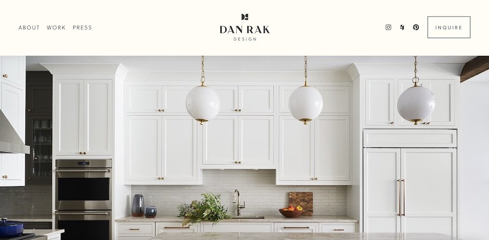
When a visitor first lands on your interior design website, photography is one of the initial things they see. Greeting your website visitors with crisp, high-quality photography is one of the best ways to cast a good impression on them.
And there’s more. The way your photography shows up on your website also makes a ton of difference. Rather than putting your photos in thumbnail form for visitors to click through, put a spotlight on your best work by showcasing them in a full-width banner style. Looking at elegant, magazine-worthy work in full-screen size as soon as someone lands on the website, just hits differently!
2. Whitespace
A ton of whitespace! If you’re not aware of what whitespace is - it is just empty space that adds breathing room to a design. Whitespace allows for easy navigation and has the ability to make websites for interior designers just so visually pleasing.
One really quick and simple way to level up the look and feel of your interior design website is to add whitespace! Just adding a good amount of whitespace between different sections on your webpage can transform your website from feeling cluttered to feeling more premium and professional. And it’s something you can achieve on your own easily within a few minutes! Go ahead and knock that one out, right away!
3. An aesthetic color palette
Interior designers usually spend a lot of time and give careful consideration to choosing the perfect colors for their client’s homes. When it comes to your own online home that is your website, an aesthetic color palette works wonders. Unique brand colors when used strategically across your interior design website, can give your brand a distinct look and feel which in turn makes your brand stand out among the competition.
Choosing a perfect color palette is one of those details that you shouldn’t miss as a creative service professional. To help you get started with a color palette for your interior design website, I’ve put together a list of 10 aesthetic color palettes. Have fun working with the colors!
4. A Stylish Font
With the level of aesthetic work you do, it’s only fair that websites for interior designers reflect that level of high quality and craftsmanship. Using Stylish fonts across your website is a fun and easy way to extend the aesthetic feel of your brand beyond the physical work you deliver to your clients.
Every font has a distinct personality just like your brand. Take your time to choose a stylish font that represents your brand’s vibe - one that you can use for years to come. My favorite place to find the best fonts when I design websites for interior designers is You Work For Them. You can choose from thousands of fonts to give your interior design brand a stand-out look and feel at an affordable price!
Pro tip: For a leveled-up luxurious look, add contrast to your font combination. Use a thicker weight for headings and a regular weight for body text. The result is always great!
5. A Polished Brand Identity
The quality of visuals and overall appearance says a lot about the quality of services you provide. A polished and leveled-up brand identity design instantly helps people believe that your brand can be trusted when you’re operating in a premium space as interior design.
Even if you have a simple type-based logo design or a simple monogram mark - the brand identity should be well-designed with attention to detail. When a high-quality brand identity shows along with your beautiful work on your interior design website, the whole look speaks volumes. Selling luxury interior design services? Your website does the convincing for you!
If you’ve been looking to level up the look and feel of your interior design business, check out how I can help you with your brand and website design.
Bonus Feature!
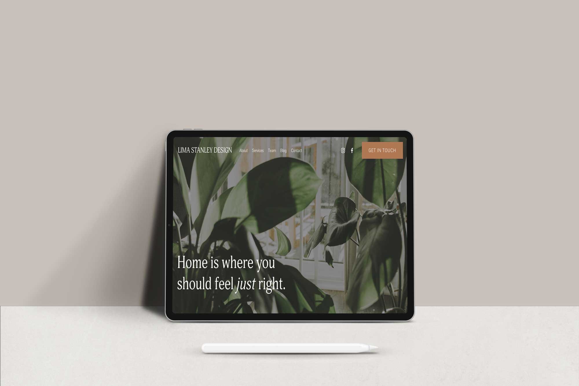
The one feature that your interior design website is incomplete without is a Call To Action Button. Once you’ve managed to cast a spell on your website visitors with gorgeous photography and consistent branding - don’t leave money on the table by not giving them an opportunity to take action. Make sure your “get in touch”, “schedule a call” or “inquire” button is clearly visible. Adding calls to action strategically throughout your website increases your chances of conversions massively!
Building brands with strategy + love,
Ridha


