
11 Nature Color Palettes To Elevate Your Brand And Boost Engagement

Nature is the ultimate artist, effortlessly blending colors to create breathtaking landscapes, vibrant ecosystems, and harmonious visuals that inspire branding, design, and consumer psychology. From the serene hues of a forest to the striking contrast of a desert sunset, nature’s color palettes hold profound significance in human perception, brand identity, and marketing appeal.
The Psychological and Branding Impact of Nature Color Palettes
Nature color palettes influence human emotions, brand perception, and consumer behavior. Green, abundant in forests, is associated with relaxation and health, making it a go-to for organic and wellness brands. Blue, dominant in oceans and skies, conveys trust and stability, making it a staple in corporate and financial branding. Warm desert hues invoke feelings of comfort and nostalgia, ideal for brands emphasizing authenticity and storytelling, while cool mountain shades suggest resilience and introspection, often used by high-performance and adventure brands.
Culturally, colors carry symbolic meanings that influence branding choices. In Eastern traditions, red symbolizes luck and prosperity, often inspired by the vivid hues of flowers and sunsets. In Western cultures, earthy tones are linked to sustainability and eco-consciousness, reflecting nature’s inherent balance and the growing demand for ethical branding.
Related post: 10 Aesthetic color palettes for your professional services brand
The Science Behind Nature Colors
Colors in nature arise from various physical and chemical processes. Pigments such as chlorophyll give plants their green hues, while anthocyanins produce reds, purples, and blues in flowers and autumn leaves. Structural coloration, found in peacock feathers and butterfly wings, results from microscopic structures that reflect light, creating iridescent effects. These natural phenomena shape the diverse and mesmerizing color palettes that influence branding and visual communication in the digital world.
A nature-inspired color palette—featuring earthy greens, browns, soft blues, and warm neutrals—can work beautifully for service-based businesses that align with natural elements, wellness, or sustainability. Here are some specific examples:
Organic Landscaping & Garden Design Services – Uses greens, browns, and soft yellows to reflect the natural world.
Holistic Health & Wellness Coaching – Soft blues, sage greens, and warm neutrals to evoke calm and balance.
Eco-Friendly Cleaning Services – Light greens and earthy beiges to represent cleanliness and sustainability.
Nature-Inspired Interior Design – Muted greens, stone grays, and wood-toned browns for a cozy, organic aesthetic.
Outdoor Adventure & Guided Hiking Tours – Deep forest greens, earthy browns, and sky blues to reflect the outdoors.
Handmade Natural Skincare Services – Soft pastels, creams, and botanical greens for an organic, gentle feel.
Sustainable Event Planning – Warm terracottas, deep greens, and neutral linens to highlight an eco-conscious approach.
Reiki or Massage Therapy – Earthy tones and soft ocean blues to create a tranquil and grounding atmosphere.
Farm-to-Table Catering Services – Warm wheat tones, olive greens, and rustic wood hues for a fresh and natural vibe.
Yoga & Meditation Studio – Muted greens, blues, and earthy taupes to reinforce a peaceful and grounded energy.
Examples Of Nature Color Palettes Used In Branding and Design (With Hex Codes)
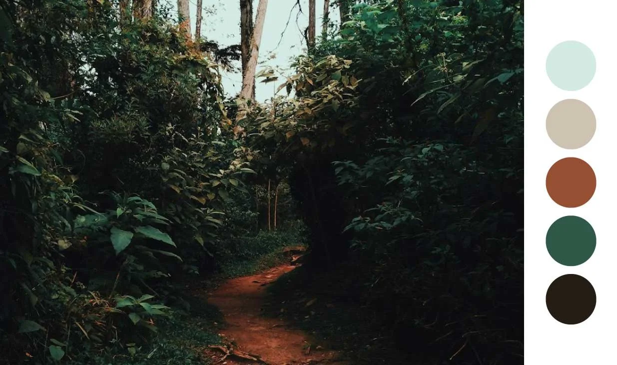
1. FOREST AND WOODLAND TONES
The deep greens of foliage, rich browns of tree bark, and soft golden hues of sunlight filtering through leaves create a palette associated with growth, tranquility, and renewal. These colors are frequently used in eco-friendly branding, wellness brands, and sustainable product packaging, evoking feelings of stability and a connection to nature.

Hex codes (from top to bottom)
#F1FFFF
#C8E8FF
#E6EB51
#375A0A
#010101
Hex codes (from top to bottom)
#D3EAE4
#CEC2B2
#964F33
#2F5848
#261D14
2. OCEAN AND COASTAL HUES
The blues of the ocean range from the deep navy of the abyss to the turquoise of tropical waters. Sandy beiges, coral pinks, and pearlescent whites complete the palette, reflecting serenity, openness, and calm. These colors often influence spa branding, travel marketing, and luxury lifestyle brands seeking to convey relaxation and sophistication.

Hex codes (from top to bottom)
#EDE8E5
#C9C4C1
#79C0BC
#428CA9
#003249

Hex codes (from top to bottom)
#FFFFFF
#E8D6D4
#DD9348
#A7CBBF
#332E44
3. DESERT AND CANYON SHADES
Sunbaked landscapes offer a warm palette of burnt oranges, terracotta reds, and sandy yellows. These colors, found in the Grand Canyon or the Sahara, exude warmth, resilience, and rustic beauty. Earthy tones are frequently used in fashion branding, interior design, and artisanal product packaging, symbolizing endurance and timelessness.

Hex codes (from top to bottom)
#F9F1DC
#EADAC0
#FFB966
#A77E55
#4E3414

Hex codes (from top to bottom)
#F9F5F2
#FFCBCA
#FC7953
#B7767E
#2B0905
4. MOUNTAIN AND TUNDRA COLORS
The cool grays of rugged rocks, snow-capped whites, and the deep blues of alpine lakes compose a stark yet awe-inspiring palette. These hues are often used in minimalist design, outdoor gear branding, and high-end technology brands, evoking feelings of clarity, stillness, and grandeur.

Hex codes (from top to bottom)
#EDF5F9
#CADCEB
#4F7092
#A6B7CF
#121D1E

Hex codes (from top to bottom)
#F0E6DD
#D1C5AF
#B08153
#1B5B64
#322A17
5. FLORAL AND MEADOW BRIGHTS
Wildflowers offer vibrant bursts of color—lavender purples, sunflower yellows, poppy reds, and sky blues. This cheerful palette signifies energy, creativity, and joy, commonly used in cosmetics branding, fashion campaigns, and youthful, playful design aesthetics.

Hex codes (from top to bottom)
#F4EEE4
#DBB6AE
#C5235A
#D9AA5F
#3E2B24

Hex codes (from top to bottom)
#E4E6F7
#B191C9
#F4C93B
#7F9A6D
#25240E

Hex codes (from top to bottom)
#ECEEEB
#D2D6BD
#E13E2D
#8A9668
#19231B
Conclusion
Nature’s color palettes are not just visually captivating but deeply embedded in branding and design strategy. They shape brand identity, emotional connections, and cultural narratives. By observing and integrating these natural hues, brands can foster deeper engagement, authenticity, and a strong visual presence that resonates with consumers on an instinctive level.
Need help choosing the right color palette for your brand? Let’s work together to develop a beautiful and strategic brand identity for your small business.


